
Kalifornien Bevölkerungsrückgang Karte Chart
Passen Sie diese Diagrammvorlage für den Bevölkerungsrückgang in Kalifornien noch heute an!

 100 % anpassbare Vorlagen
 Millionen Fotos, Symbole, Diagramme und Grafiken
 KI-gestützte Bearbeitungsfunktionen
 Mühelos teilen, herunterladen, einbetten und veröffentlichen
 Generieren Sie ganz einfach QR-Codes für Ihre Designs
- Designstilmodern
- FarbenLicht
- GrößeLetter (11 x 8.5 in)
- DateitypPNG, PDF, PowerPoint
- Planenfree
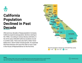
Die Karte mit dem Bevölkerungsrückgang zeigt die prozentuale Veränderung der Bevölkerung in den einzelnen Bezirken. Einige der Hauptgründe für den erheblichen Rückgang in Kalifornien sind eine alternde Bevölkerung, niedrigere Geburtenraten und die Abwanderung in andere Bundesstaaten. Es ist zwar offensichtlich, dass die Gesamtbevölkerung zurückgegangen ist, aber die Geschwindigkeit, mit der sie abnimmt, hat sich verlangsamt. Die Karte mit dem Bevölkerungsrückgang basiert auf den neuesten Daten der American Community Survey des Census Bureau. Die Datenerhebung für die Erhebung begann im Jahr 2005 und umfasste eine Stichprobengröße von etwa drei Millionen Adressen. Das Diagramm zum Bevölkerungsrückgang ist Teil einer Sammlung von Karten und Diagrammen sowie anderen Tools und Datensätzen, die den Nutzern helfen, ihre Daten auf neuartige Weise zu visualisieren, zu analysieren und zu verstehen. Erstellen Sie ein beeindruckendes Diagramm zum Bevölkerungsrückgang mit der Venngage California Population Decline Map Chart Vorlage. Um dieses Diagramm zu ändern, benötigen Sie keine Design-Talente und müssen keine Design-Tools herunterladen. Klicken Sie einfach auf die Schaltfläche "Erstellen", um Ihr eigenes Diagramm zum Bevölkerungsrückgang in Kalifornien zu erstellen. Fügen Sie zunächst Ihren Inhalt hinzu. Sie können die Standardschriftart der Vorlage verwenden oder
Verwandt mit Diagrammvorlagen
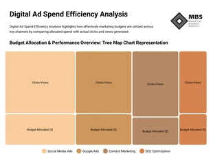
Baumkarte Diagramme
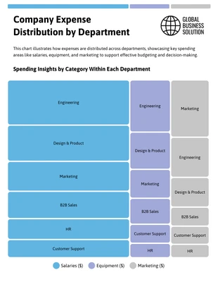
Baumkarte Diagramme
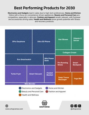
Baumkarte Diagramme
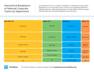
Baumkarte Diagramme
Baumkarte Diagramme
Kartendiagramm Diagramme
Baumkarte Diagramme
Baumkarte Diagramme
Baumkarte Diagramme
Baumkarte Diagramme
Baumkarte Diagramme
Baumkarte Diagramme