
Kartendiagramm der Gesundheitsausgaben der Vereinigten Staaten
Erstellen Sie diese Kartenvorlage mit Venngage Map Maker!

 100 % anpassbare Vorlagen
 Millionen Fotos, Symbole, Diagramme und Grafiken
 KI-gestützte Bearbeitungsfunktionen
 Mühelos teilen, herunterladen, einbetten und veröffentlichen
 Generieren Sie ganz einfach QR-Codes für Ihre Designs
- Designstilmodern
- FarbenLicht
- GrößeLetter (11 x 8.5 in)
- DateitypPNG, PDF, PowerPoint
- Planenbusiness
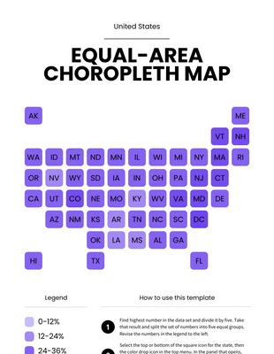
Diese Diagrammvorlage für eine Karte der Gesundheitsausgaben der Vereinigten Staaten ist die perfekte Vorlage, um zu visualisieren, wie viel Geld jeder Staat für die Gesundheit ausgibt. Die Vorlage zeigt, dass die nördliche Region der Vereinigten Staaten im Allgemeinen mehr für Gesundheit ausgibt als jede andere Region oder Region. Diese Vorlage ist die perfekte Wahl für alle, die herausfinden möchten, wie viel Geld jeder Staat für die Gesundheit ausgibt. Die Vorlage kann je nach Bedarf einfach bearbeitet und geändert werden. Mit dieser Vorlage erhalten Sie sehr genaue Ergebnisse, da sie auf Daten basiert, die von offiziellen Stellen wie census.gov gesammelt wurden. Die Vorlage kann auch verwendet werden, um die durchschnittlichen Gesundheitsausgaben pro Person in den USA zu visualisieren. Da es sich bei einer Karte zu den Gesundheitsausgaben der Vereinigten Staaten grundsätzlich um eine visuelle Darstellung von Daten handelt, müssen Sie kein professioneller Künstler oder Designer sein, um eine wirkungsvolle Karte zu erstellen. Tatsächlich sind die meisten Vorlagen auf unserer Website sehr einfach und leicht zu bearbeiten. Entwerfen Sie ein professionelles Kartendiagramm für die Gesundheitsausgaben der Vereinigten Staaten mithilfe der Kartenvorlage für die
Verwandt mit Diagrammvorlagen
Baumkarte Diagramme
Liniendiagramm Diagramme
Histogramm Diagramme
Balkendiagramm Diagramme

Histogramm Diagramme
Baumkarte Diagramme
Kartendiagramm Diagramme
Baumkarte Diagramme
Kartendiagramm Diagramme
Baumkarte Diagramme
Baumkarte Diagramme
Baumkarte Diagramme